
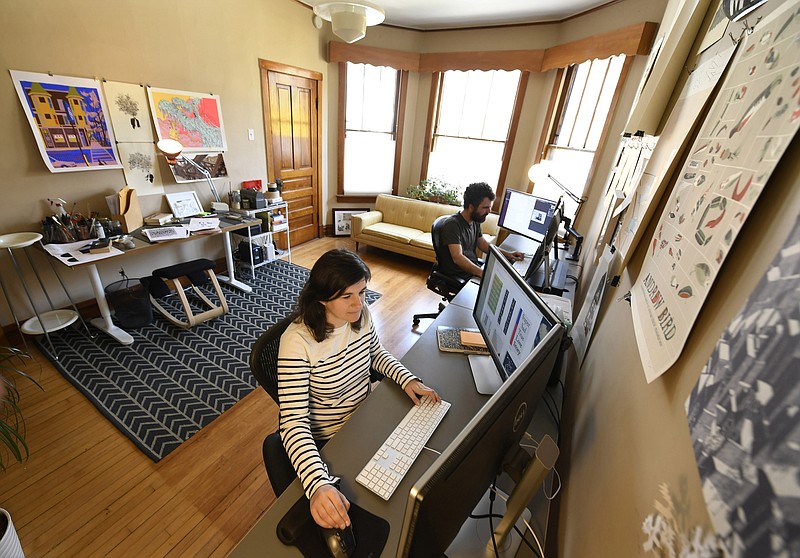
CHICAGO-Several years ago Jenny Volvovski decided she would design book covers for books that already had covers. Often perfectly good covers. She wasn't dissatisfied with the state of graphic design or anything. She just wanted to design covers for new books, and as a member of ALSO, a small graphic design firm based in Chicago and Brooklyn, she was working primarily for architects and online retailers and culinary clients-she created menus for the Lincoln Park bakery Floriole and Logan Square restaurant Giant. "But I wasn't getting book work, and since I read a lot, I figured, for fun, as an exercise, I would do it anyway, to see what I came up with."
She set parameters.
She restricted herself to three colors-green, black and white. Type could be handwritten, created with a typewriter, or one of two fonts, Futura bold or Caslon italic. And any image had to be original, created by Volvovski, not cut-and-pasted from Google. "I set those limits to end up with covers that would look like they came from part of a larger series-like from some big, cohesive, fake library."
A publishing house of one's own.
With a single overriding parameter, her most fundamental rule of all: Every time Volvovski finished reading a book, she had to design an alternative cover for the book.
That was many books ago.
Volvovski named the project "From Cover to Cover," though really it's more of a hobby-not found in a coffee-table book, never shown in a gallery, not intended for anyone in particular. She posts work on From-Cover-to-Cover.com, and that's it. But what she comes up with is often strikingly free of conventions, a frequent reminder of the timidity of commercial publishing. Sometimes you have to adjust your eyes to her work before recognizing even the most familiar title: Crown's cover for Andy Weir's "The Martian"-adapted into a 2015 Matt Damon film-shows an astronaut on a red, dusty Mars; Volvovski's cover looks encased in the same gray duct tape the book's hero uses to make repairs.

Here is how she did it:
What you don't quite see by just visiting her website is the literal labor of love involved: To make her "Martian" cover, Volvovski wrapped a digital scanner in duct tape, cut out letters for the title and author, then layered in the cut-out chunks of letters until it looked three-dimensional.
After reading Frank Herbert's desert epic "Dune," she bundled the same scanner in plastic wrap, poured beach sand over the top and sketched out the title with her finger.
Many of her covers reveal a sort of obsessive, method approach to graphic design: "After I read 'The Cartel' (by Don Winslow, about the Mexican drug wars), I made a straightforward cover (just title and author), then stuck it to a tree. I could have stabbed it with a knife but we were in Maine-I shot it a bunch of times with a BB gun. I think it's more satisfying when you create a physical thing."