
Once I start toward a season, it's hard to stop. I've been gathering speed down the slippery slope of seasonal goodies and have transitioned from transitional tabletops into a full-on fall festival quicker than you can say "it's only September." I am always surprised by some of the perceived "rules" that seem to pop up surrounding specific times of the year. A common misconception when gearing up for autumn is that you are limited to a certain color palette to be seasonally appropriate. Untrue! While I do enjoy more spiced hues and muddy tones to match the changes we see outside, there are many ways to bring a more seasonally appropriate approach to your home regardless of color palette. I've gathered a few different fabric groupings that range in tone from classic fall feels to a crisp autumn evening to show it's easy to pivot into a new season with a little textile fun.

Classic autumn hues
Sure, while you can achieve a fall look in any color journey, why skip tradition? These colors are classic fall for a reason. Full of spice and foliage, this fabric pairing uses the autumn color palette we know and love. I started this group with the slightly metallic embroidered cheetah textile that, aside from being stunning year-round, reminds me of crisp amber leaves falling from a tree. Instead of allowing myself to take us into jungle territory, I decided to focus on bringing in a variety of fall botanical-inspired prints as well as luxurious golden mustard and spiced wine velvets that would emphasize the warmth of our animal prints and keep our composition cozy and seasonal.

Crisp fall nights
For this combination, I wanted to go in a completely different direction than what would be expected for autumn with cool, icy tones that bring forth memories of crisp fall nights and dove gray rainy skies. During the fall I love curling up with a cup of tea and a good book as I observe the overcast and drizzling skies from the comfort of my home. While some might find this weather dreary, I find the gray tones to be lovely and calming. With a lack of color in this layout, texture is queen. By using layers of geometric linens and thick, rich velvet designs, this combination goes from just gray to great. The texture gives this design the depth and warmth that would usually come from a more vibrant color combination.
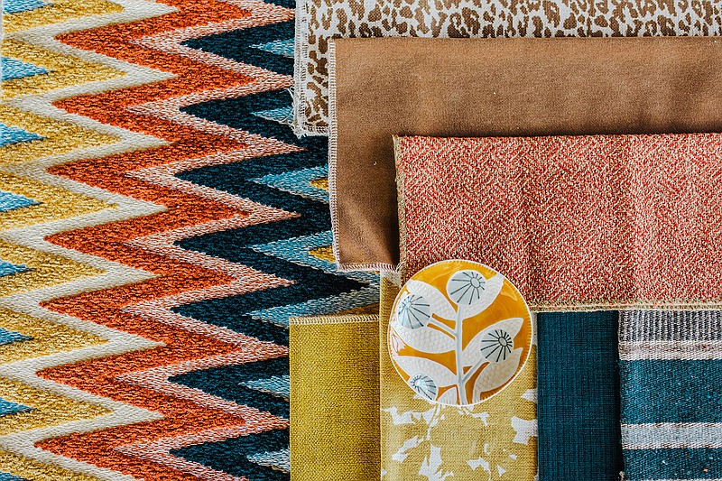
Warm and bright bohemian
Just when you thought you knew what I would create next, I zig then zag! I couldn't resist building a look around this bold fabric that takes texture to the next level with its terry cloth feel and deep grooves. To keep these sunny shades grounded in our current season, I've used a mix of wool knit and brown velvet as visual anchors. The display is a delicate balance of hues that range from bright to muddy and textures that range from soft to rough. It is reminiscent of a Midwest fall, where we have an unpredictable balance of sun and rain and alternating days of warmth and chill.
Adapted from nellhills.com. Katie Laughridge is the owner of Kansas City interior design destination Nell Hill's. For more information, contact Katie at [email protected].